
One Liberty
My roles
Liberty Insurance and Liberty Specialty Markets were coming together under a single identity across Asia Pacific: Liberty.
Building on a recent rebrand developed by another agency, I was tasked with creating a distinctive campaign device that visually communicated the unification of the two businesses while aligning with the new brand direction.
How it started
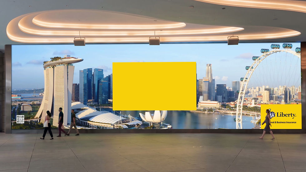
22m wide screen at One Raffles Place, Singapore
Building on Liberty’s preference for the logo positioned within a yellow rectangle, I developed a campaign device centred around an angled Venn diagram.
The concept reinforces Liberty’s new brand identity while visually communicating the coming together of two businesses as one. The overlapping shapes create a focal point within imagery and video, drawing the viewer’s attention to key details.
The flexible design also allows imagery to be tailored to different audiences and markets across Asia Pacific, while maintaining a consistent visual identity.
The concept

The campaign came to life across digital, print, social media and out-of-home (OOH) advertising, creating a consistent and recognisable visual identity across multiple touchpoints.
A standout element was the design and animation of a video for a 22-metre-wide, 9K digital mega screen at One Raffles Place in Singapore.

The assets


